Global Correlations Part 1
I downloaded MSCI regional monthly returns for North America, Europe, BRIC countries, Asia, and Latin America from January 2001 to October 2017. Figure 1 displays statistics for the five regions over 202 months.
Figure 1
| N_AMERICA | EUROPE | BRIC | ASIA | EM_LATIN_AMERICA | |
| Mean | 0.439 | 0.355 | 0.827 | 0.417 | 0.825 |
| Median | 1.089 | 0.529 | 1.250 | 0.976 | 1.341 |
| Maximum | 11.624 | 13.053 | 17.279 | 12.955 | 16.919 |
| Minimum | -24.268 | -23.882 | -39.573 | -22.623 | -42.882 |
| Std. Dev. | 3.873 | 5.452 | 6.649 | 4.410 | 6.920 |
| Skewness | -1.796 | -0.796 | -1.295 | -0.888 | -1.461 |
| Kurtosis | 11.180 | 4.897 | 9.013 | 6.265 | 9.893 |
| Jarque-Bera | 671.6936 | 51.62247 | 360.7243 | 116.2527 | 471.798 |
| Probability | 0 | 0 | 0 | 0 | 0 |
| Observations | 202 | 202 | 202 | 202 | 202 |
Source: MSCI & GLP Risk Management, Inc.
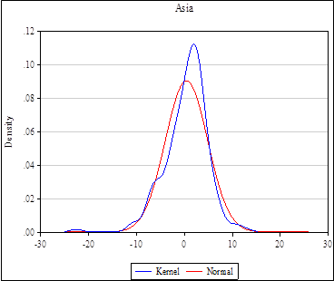
One interesting point is that the Jarque-Bera statistic indicates that none of the returns may be considered normally distributed. This can be seen in figure 2, a distribution chart, of Asia compared to a normal distribution.
The blue line is a distribution of the data using a kernel density. The red line is a normal distribution based on the mean and standard deviation of the data. The historical data shows a much higher kurtosis than the normal (more mass in the center of the distribution).
Figure 2

Correlations
Correlations over the entire period are shown in figure 3.
Figure 3
| N_AMERICA | EUROPE | BRIC | ASIA | LATIN_AMERICA | |
| N_AMERICA | 1.000 | 0.677 | 0.772 | 0.793 | 0.765 |
| EUROPE | 0.677 | 1.000 | 0.625 | 0.590 | 0.603 |
| BRIC | 0.772 | 0.625 | 1.000 | 0.859 | 0.933 |
| ASIA | 0.793 | 0.590 | 0.859 | 1.000 | 0.786 |
| LATIN_AMERICA | 0.765 | 0.603 | 0.933 | 0.786 | 1.000 |
Correlations in 2008 were higher and are shown in figure 4.
Figure 4
| N_AMERICA | EUROPE | BRIC | AC_ASIA | LATIN_AMERICA | ||
| N_AMERICA | 1.000 | 0.826 | 0.922 | 0.938 | 0.926 | |
| EUROPE | 0.826 | 1.000 | 0.896 | 0.891 | 0.884 | |
| BRIC | 0.922 | 0.896 | 1.000 | 0.982 | 0.966 | |
| AC_ASIA | 0.938 | 0.891 | 0.982 | 1.000 | 0.945 | |
| LATIN_AMERICA | 0.926 | 0.884 | 0.966 | 0.945 | 1.000 | |
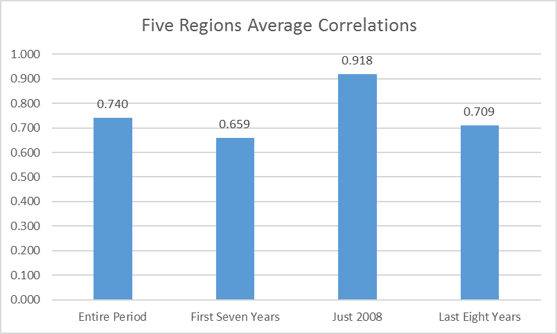
It can be difficult to identify higher or lower correlations in a table. I averaged the correlations for several periods and these can be seen in figure 5.
Figure 5

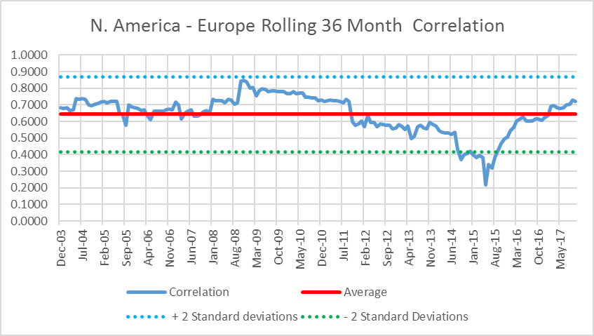
For many years the investment community believed that correlations were constant. The chart and tables above confirm that in times of financial stress (2008) correlations across the board increase. Just when an investor needs diversification, it disappears. The final figure in this short piece shows that on a rolling 36 month basis correlations do indeed change.
Figure 6

From December 2003, to October 2017, the rolling 36 month correlation between North America and Europe varied between 0.22 and .85. The average correlation for the entire seventeen year period (almost) was 0.64. In 20015, the correlation was at its lowest point well below two standard deviations from the mean. It was approximately 3.75 standard deviations below the mean!
There are several conclusions from this short analysis:
- Correlations are not constant. They can and do change often in a significant manner. This has important implications for portfolio optimization.
- While it is useful to know past correlations, they contain little or no information useful to forecast future correlations. Just like investors know that past returns contain no information about future returns, past correlations contain no information about future correlations.
- And remember investors care about future correlations.

